Redesign
Status: draft
A redesign of this website
Great websites do two things really well: they’re beautiful, and have great content. Even if someone is drawn to a website because of its content––making it fun to use is just as crucial. Beauty matters––and websites are no different. In the redesign of this blog, my aim is to try and bring elements of originality, usability and playfulness together.
“But we need only one of these, right?”: on design choices
During his years as a programmer at Apple, Ken Kocienda says in his book “Creative Selection” how they were once showing a demo of a virtual keyboard for the yet to be released iPad to Steve Jobs. One designer had opted for more keys on the virtual keyboard which included numbers. However, by including numbers on the keyboard, the space allocated to letter keys had to be made smaller. Ken Kocienda’s keyboard did not include numbers; just big keys for letters and the function keys––essentially the same keyboard on iPhones and iPads now.
The designers decided to give users the option of choosing which keyboard they wanted by adding a “zoom” button onto the virtual keyboard; when pressing the “zoom” key on the keyboard with larger keys, it switched to the keyboard that also had numbered keys. When they showed this new keyboard to Steve Jobs, they asked him to press the “zoom” button. And so he pressed it, and the numbered keyboard was displayed. Then he pressed it again. The keyboard with the larger keys was displayed. Ken Kocienda then describes how Steve Jobs swiveled in his chair to face him, looked him in the eye and said, “but we need only one of these, right?”.
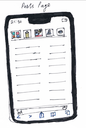
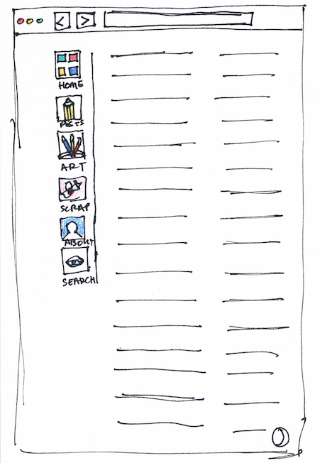
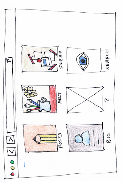
Redesigning a website can be challenging because of conflicting functions––for example you might like the way a design feature works one way, but may prefer the aesthetics of another design choice. This is precisely the problem I have run into: do I opt for a colourful home screen with six icons (see image 2 below, “third draft of the home page”), or a functional icon based interface that users can also navigate from individual pages (see the first image below, “posts homepage with left sided coloured menu”)? Compare the first two images below. Functionally speaking, the first image with the left sided navigation menu makes more sense––I can access all pages from that menu. The second design in image two, with the six home icons, represents a wider design change, but an extra step would be added––you can go back to the “home” icons from any page by pressing the “home” button. But why should a user need to go back to the home page when they can already access the other pages of the site from one single navigation menu?
Posts homepage with left sided coloured menu
Third draft of the home page
Second draft of the home page
Draft of panel home page icons
Draft of home icons
Draft of posts icons
Draft of art page icons
Posts page with home icon
Posts page wireframe for mobile